
Driver Recruiting Metrics: What to Watch Beyond Leads and Hires

12 min
Ask most carriers how last month went and you'll get two numbers: leads in, drivers seated. At a handful of applications a week, that's all the visibility you need.
It stops being enough the month you cross 100 leads. At that volume you're spending real ad money and real recruiter hours, and "leads in, drivers out" won't tell you whether either is going where it should. That's the signal to start analyzing where your ad budget goes — and where your team's time could do more.
"400 leads, 22 hires" tells you the month happened. It doesn't tell you which sources sent the 22 who signed and which sent 200 tire-kickers, that 6 of the 22 quit before their first settlement cleared, or what to change next month.
Good driver recruiting metrics only earn their keep when they change a decision — a report should end in a phone call, a vendor email, or a line item cut from the ad budget. So that's how we'll read the pipeline below: for each number that matters, what it's quietly telling you to fix, and who you hand it to.
The headline driver recruiting metrics — then leave them behind
Everything below lives in Double Nickel, the driver recruiting platform we build for carriers. Its Pipeline Analytics dashboard opens on a strip of headline metrics, then breaks the pipeline into three tabs for the questions that actually change decisions — Marketing (which sources are worth the spend), Performance (how each recruiter is really doing), and Retention (who stays). We'll walk them in that order.
Every figure in this article uses illustrative sample data to show how the views work. The numbers do not reflect the actual performance of any named lead source or marketing partner.

Start with the top-line strip. The numbers that sit above everything else are:
Total leads — every applicant who came in during the window, across every stage.
Total hires — drivers seated in the window, counted on hire date, not application date.
Cohort hires and conversion rate — of the people who applied in this window, how many were eventually hired. This is the one to internalize. Conversion rate is cohort hires divided by total leads, and it's the honest measure of whether the top of your funnel is worth anything.
Time to hire — average days from application to seat.
90-day retention — of the drivers hired in this window, the share still active 90 days later.
The reason cohort conversion matters more than a raw hire count: raw hires mix together people who applied last week with people your team has been nurturing for two months. Cohort conversion ties the outcome back to the batch of leads that actually generated it. When you're grading a marketing source or a recruiter, that's the fair comparison.
Watch these five over time and you'll catch the big swings. But the big swings aren't where the money is. The money is one level down.
The Marketing view: stop grading sources by volume
Every recruiter knows their busiest lead source. Far fewer know their best one, because volume and quality almost never line up.
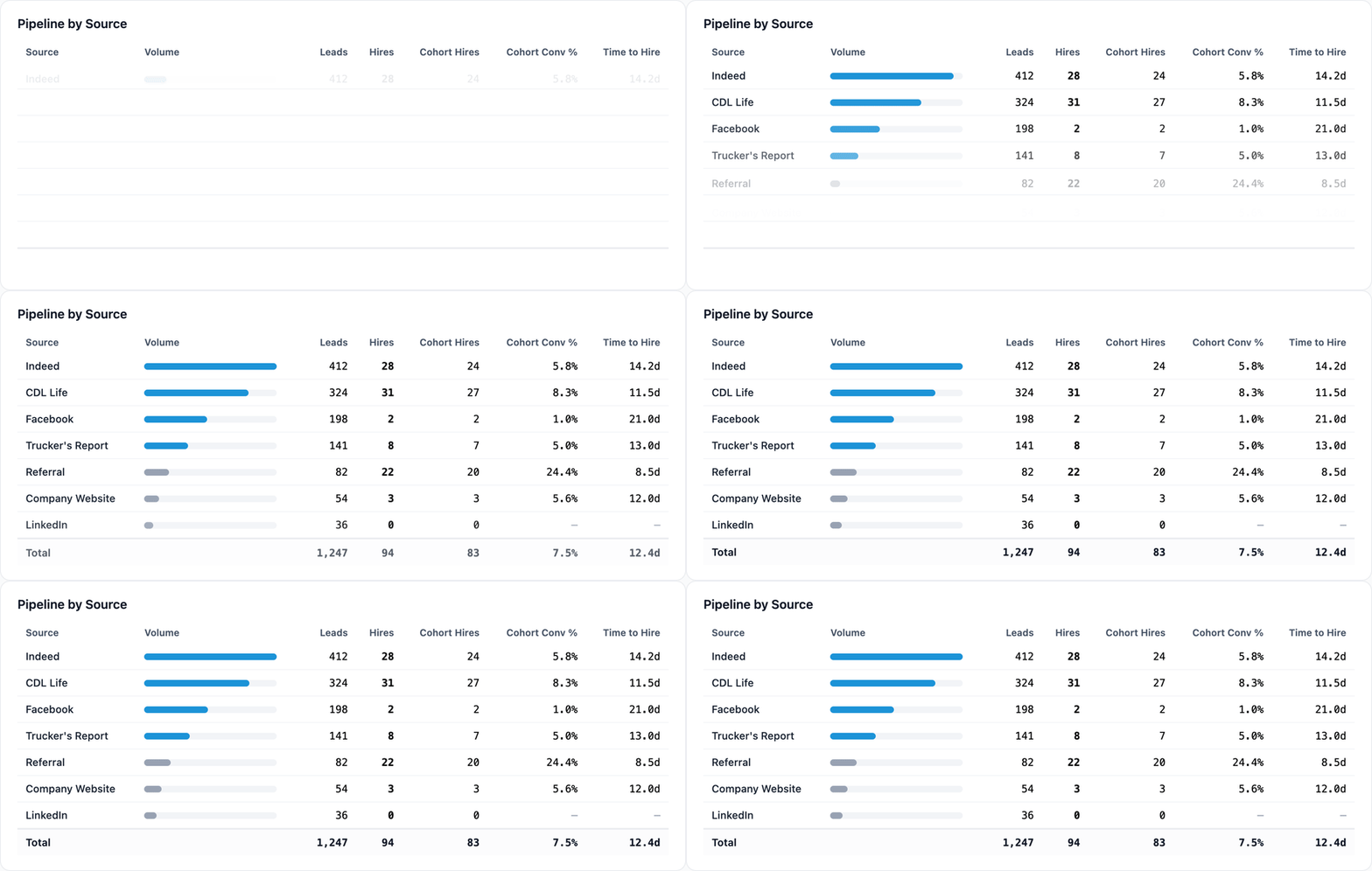
This is the trap. Indeed or a paid social campaign will happily flood you with applications, and the raw lead count looks great on a dashboard. Then you follow those leads down the funnel and half of them ghost after the first text. Meanwhile your referral trickle — 15 leads all month — converts at three times the rate and the drivers stick.
What to watch in your marketing funnel
Start with the number everyone skips: why people fall out. It's easy to rank your sources by conversion rate and call it a day, but a conversion rate doesn't tell you what to fix. The reasons behind it do — so find out why leads are getting marked "not interested" and why applicants are getting disqualified, and do it source by source.
In the Marketing tab, that's what the Pipeline Outcomes table is for. It lays your funnel out with stages down the side and sources across the top, then expands the two places leads actually die — Not Interested and Disqualified — into the real reasons underneath each one. In Double Nickel, every time an applicant is marked not interested or disqualified, a reason gets logged, and this table rolls those reasons up by source: the heavier the cell shades, the bigger that reason's share of the column. So instead of "this source converts at 4%," you see why — one source's leads are mostly "doesn't have the right endorsement," another's are mostly "wanted more home time" — without opening a single applicant record.
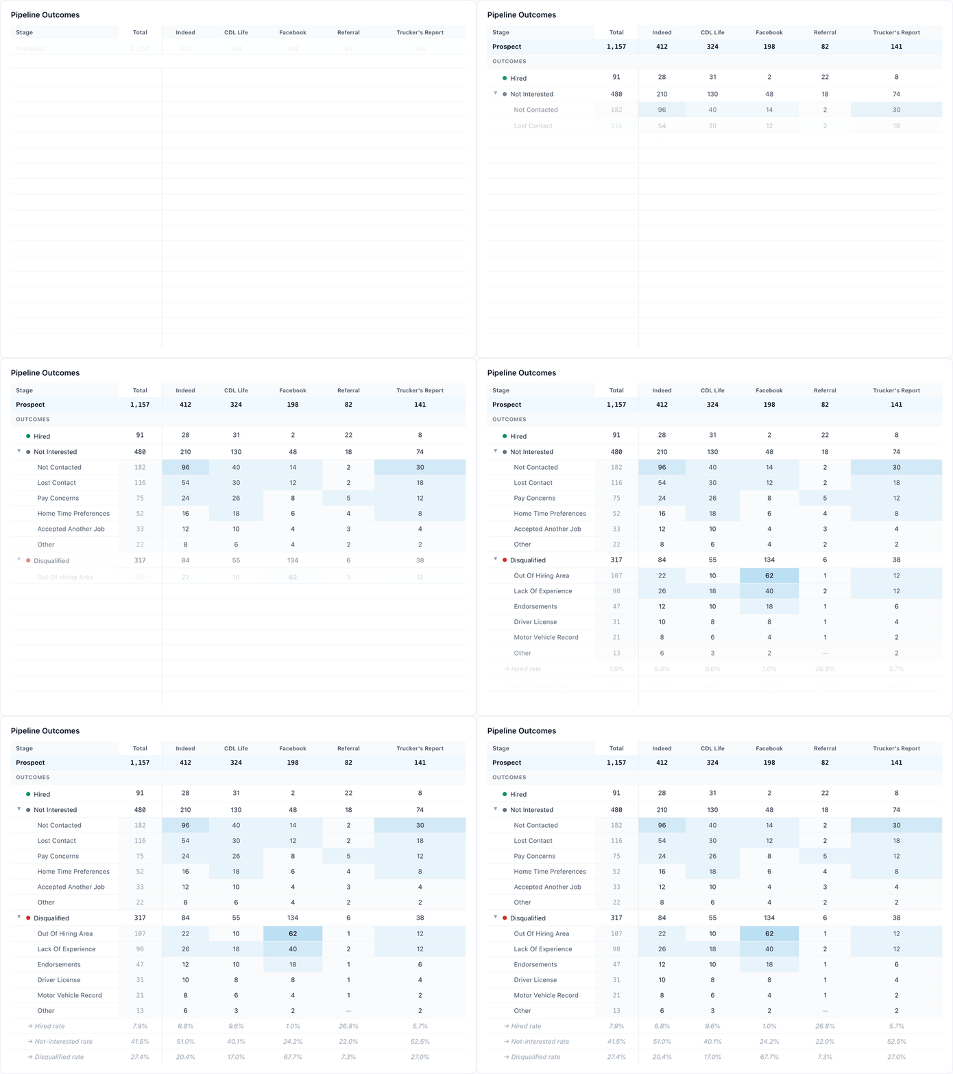
That distinction is the whole point, because it changes who owns the problem. A wall of "no CDL" or "outside hiring area" disqualifications isn't your recruiters working leads badly — it's a targeting problem you can hand straight back to the vendor. A stack of "pay too low" or "home time" on the not-interested side isn't a marketing problem at all; it's the job, and no amount of better ad spend fixes it.
READ THE SIGNAL
A wall of "Not Contacted."
YOU SEE
A big share of a source's leads dying at Not Contacted or No Response.
IT MEANS
The leads aren't the problem — your follow-up process or your marketing style is. Either no one worked them fast enough, or the ad set an expectation the first call couldn't match.
DO THIS
Tighten speed-to-lead and follow-up cadence first. If it's isolated to one source, its audience or creative is pulling in drivers who were never going to pick up.
READ THE SIGNAL
"Outside hiring area" or "No CDL."
YOU SEE
A large share disqualified for being out of your hiring area or not holding the right license.
IT MEANS
This one is not on your recruiters at all — it's marketing. The campaign is reaching the wrong people.
DO THIS
Hand the disqualification reasons back to the vendor to tighten geo-targeting and audience. This is a spend decision, not a coaching one.
The Pipeline by Source table sits right above it for the headline version — leads, hires, cohort conversion, and time to hire per source, side by side — but the reasons are where you actually learn what to change next.
What to send back to your marketing providers
This is the part carriers leave on the table. You are paying an ad vendor or a job board, and most of the time the only feedback they get from you is whether you renew. Give them the data instead:
Send the disqualification reasons, by source. If a vendor's traffic is 60% "no CDL" or "outside hiring area," they can tighten the audience — but only if you tell them. Vague complaints ("the leads are bad") get vague fixes. "38% of your leads in June were disqualified for insufficient experience, here's the breakdown" gets your campaign re-targeted.
Send conversion, not clicks. Vendors optimize for what you measure them on. If all they hear about is lead volume, they'll send volume. Report back on cohort conversion and time to hire and the conversation shifts to quality.
Bring the trend line. The Pipeline Over Time chart plots each source's volume across the date range, with the bucket size adapting from days to weeks to months depending on the window. When a source's quality falls off a cliff mid-month, you can point to the exact week it happened — usually right after they "optimized" something.
The point isn't to drop vendors — it's to hold them to the same number you're held to: seated, retained drivers.
The Performance view: give recruiters their own funnel
Recruiter scorecards usually stop at "how many did you hire." That rewards whoever got handed the best leads and punishes whoever got stuck working a hard market. It also tells the recruiter nothing about how to get better.
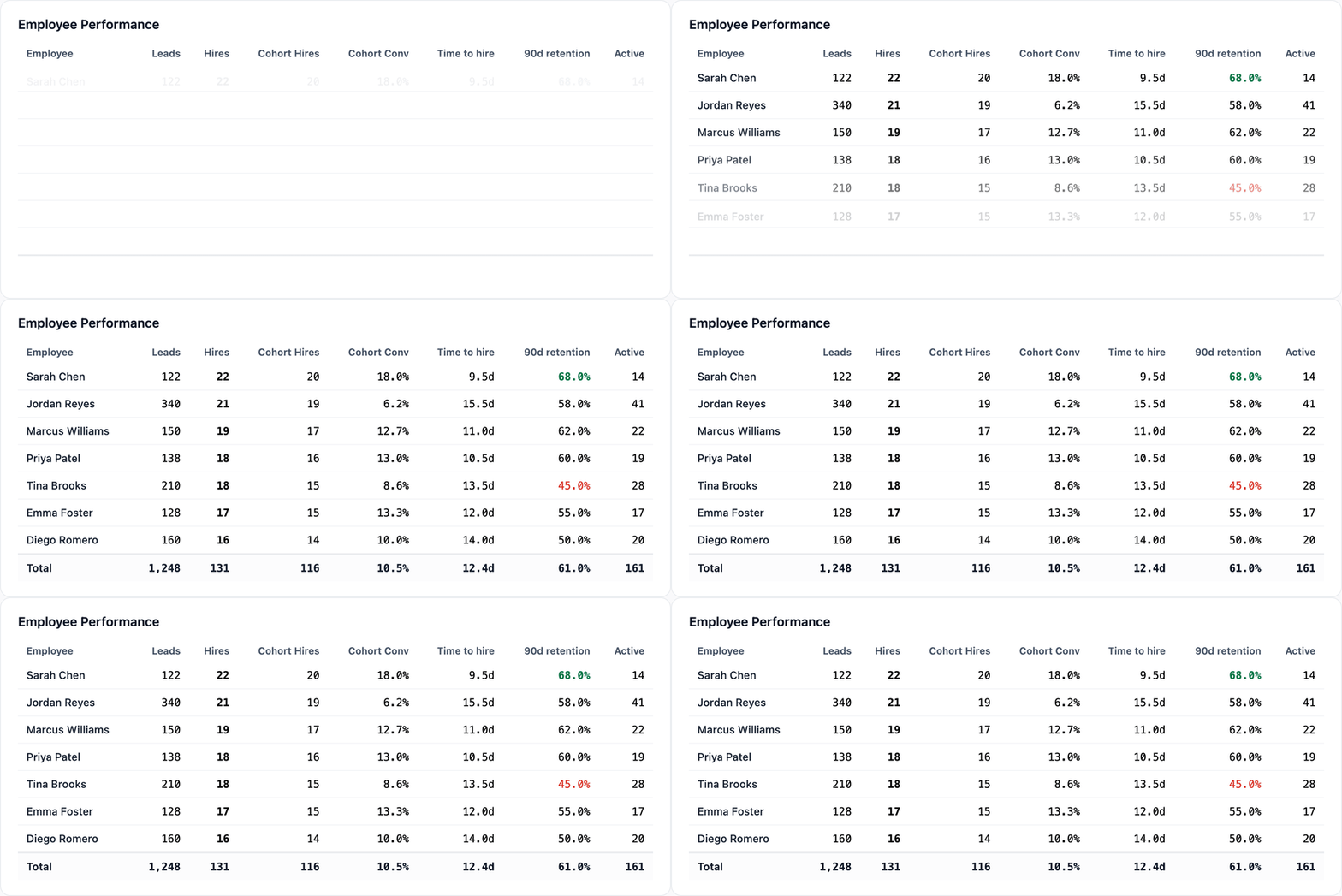
A funnel does. In the Performance tab, the Employee Performance leaderboard puts every recruiter's leads, hires, cohort hires, cohort conversion, time to hire, 90-day retention, and active pipeline in one row. Two recruiters can hire the same number of drivers and be nothing alike underneath — one converts 18% of their leads and one converts 6% but works four times the volume. Those two people need completely different coaching.
READ THE SIGNAL
A big conversion gap between recruiters.
YOU SEE
One recruiter converting far more of their leads than another.
IT MEANS
Your top performer is doing something the others aren't — and it's usually a communication habit, not raw talent.
DO THIS
Find the difference. Are they calling instead of texting? Following up faster, or more times? Whatever it is, write it down and make it the team's default — replicate what works and coach the rest up to it.
The Employee Funnels cards make it visual: a per-recruiter breakdown across prospect, hired, not interested, disqualified, and terminated, with bars scaled against the whole team so you can compare them at a glance. Where a recruiter's funnel pinches is where their coaching lives. A pile-up at "not interested" is usually a speed-to-lead or follow-up problem. A pile-up at "disqualified" late in the process means they're not pre-screening early enough and burning hours on drivers who were never going to qualify.

What to give your recruiters
Their own funnel, not just the team's. People fix what they can see. A recruiter who can watch their "not interested" rate drop week over week will chase it.
Time-to-hire as a coaching metric, not a stick. In driver recruiting the first carrier to call usually wins. If one recruiter's time to hire is double the team's, that's the single highest-leverage thing to fix, and it's almost always about follow-up cadence.
Retention on their scorecard. More on this next — but a recruiter whose hires wash out at day 45 is not actually outperforming the recruiter who hires slightly fewer drivers who stay.
The Retention view: the loop almost nobody closes
Here's the uncomfortable truth about driver recruiting analytics: most of it stops at the hire. You seated the driver, the metric turns green, everyone moves on. Then the driver quits during orientation or ghosts after their second week, and none of your recruiting reports ever connect that back to the source, the recruiter, or the job that brought them in.
Driver retention is where the real money hides, because a driver who leaves at day 45 cost you the full recruiting spend and the orientation and the truck sitting empty again — and you're now paying to replace them. Cost per hire in trucking is only half the picture. A source that delivers cheap leads who quit in six weeks is more expensive than a pricey source whose drivers stay a year.
The driver retention metrics that matter
The Retention tab is built to close that loop:
The retention curve shows, of every 100 drivers you hired in the window, how many were still active at each day out to 120, with markers at day 30, 60, and 90. The shape tells you where you're bleeding. A steep drop in the first 30 days is almost always a hiring-fit or expectations problem — the job wasn't what the driver was told. A later, gentler slide is usually pay, home time, or dispatch.
Cohort retention stacks your monthly hire groups so you can read down the 90-day column and see whether retention is trending up or down month over month. This is how you tell if a change you made in April actually helped.
Retention by lead source is the killer report. If referrals retain at 75% and a paid source retains at 50%, that's not a rounding error — that's a signal to move budget. You're not just buying leads, you're buying drivers who stay, and only this view tells you which sources deliver them.
Retention by job listing and by recruiter do the same split by role and by person. A single listing that bleeds people early usually has a pay or route problem hiding in the posting. A recruiter whose hires don't stick may be overselling the job to close it.
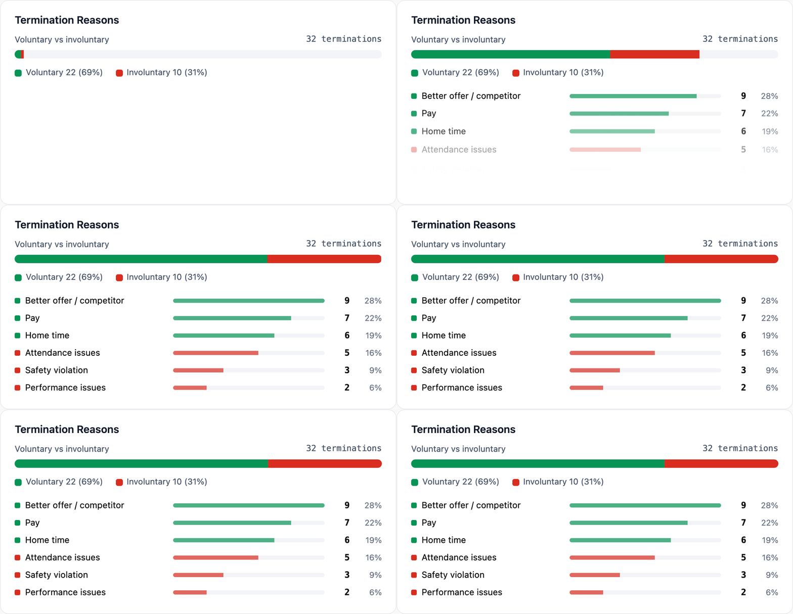
Termination reasons, split into voluntary and involuntary. This is the difference between "our drivers are leaving" and "our drivers are leaving for a competitor's sign-on bonus" versus "we're terminating them for attendance." Those are three different problems with three different owners.
Read the signal — high involuntary turnover or a bad 30/60/90 drop.
You see drivers washing out early, or a steep fall across your 30-, 60-, and 90-day retention.
It means what you sold in recruiting doesn't match the reality of the job. Somewhere between the ad, the recruiter, orientation, and dispatch, the promise and the truck stopped agreeing.
Do this: get your teams aligned on the same offer — pay, home time, route — so the driver who signs is the driver still seated on day 60. Which day the curve breaks tells you which promise broke.
READ THE SIGNAL
High involuntary turnover or a bad 30/60/90 drop.
YOU SEE
Drivers washing out early, or a steep fall across your 30-, 60-, and 90-day retention
IT MEANS
What you sold in recruiting doesn't match the reality of the job. Somewhere between the ad, the recruiter, orientation, and dispatch, the promise and the truck stopped agreeing.
DO THIS
Get your teams aligned on the same offer — pay, home time, route — so the driver who signs is the driver still seated on day 60. Which day the curve breaks tells you which promise broke.
What to send back — including to the applicant
To operations and leadership: retention by source and by job listing turns a recruiting report into a budget argument. "This source is 40% cheaper per lead and retains 25 points worse" is a sentence that moves money.
To your recruiters: pair their retention with their hire count. It reframes the job from "seat drivers" to "seat drivers who stay," which is the only version that helps the carrier.
To the applicant, before they wash out: the retention curve tells you when people leave. If your drop-off clusters at week two, that's a window to intervene — a check-in call, a dispatch fix, a straight answer about home time — while the driver is still reachable. The best retention work happens before the termination reason ever gets logged.
Make the reports end in an action
If there's one habit that separates carriers who grow their fleet from carriers who tread water, it's this: every report ends with a specific action pointed at a specific person.
Bad sources → a data-backed email to the vendor, with disqualification reasons attached.
Funnel pinch points → a coaching conversation with the recruiter, built on their own numbers.
Early washouts → an intervention with the driver and a hard look at the source and the listing that brought them in.
You don't need more dashboards. You need the three or four numbers that change what you do next, in front of the people who can act on them. Recruiting funnel analysis, lead source attribution, recruiter scorecards, and retention curves aren't there to make the month look good — they're there to make next month better.
That's the standard we build Double Nickel's Pipeline Analytics to. Every card is filterable by date range, recruiter, job listing, lead source, and job type, and the whole view exports to a workbook so you can put the right numbers in front of the right person without rebuilding a spreadsheet by hand. But the tooling is the easy part. The habit — closing the loop back to your vendors, your recruiters, and your drivers — is what actually moves the fleet.
Frequently asked questions
What metrics should carriers track for driver recruiting?
Start with five: total leads, total hires, cohort conversion rate (hires divided by the leads that actually generated them), time to hire, and 90-day retention. Cohort conversion and retention matter most — they tell you whether the top of your funnel and the drivers you seat are worth the spend. Every other useful driver recruiting metric is a breakdown of those five by lead source, recruiter, or job listing.
What's a good cost per hire in trucking?
Cost per hire in trucking varies widely by lane, market, and how much you lean on paid job boards versus referrals — so the number matters less than what you pair it with. A source with a low cost per hire whose drivers quit at day 45 is more expensive than a pricier source whose drivers stay a year. Always read cost per hire next to 90-day retention by source.
How do you measure driver retention?
Track a retention curve — of every 100 drivers hired in a window, how many are still active at 30, 60, and 90 days. Then split those driver retention metrics by lead source, job listing, and recruiter to see where drivers actually leave, and log a termination reason (voluntary vs. involuntary) every time one does.
How do you attribute hires to a lead source?
Use cohort conversion, not raw hires: of the leads a source brought in during a window, how many were eventually seated. Good lead source attribution ties each hire — and each disqualification reason — back to the source that produced it, so you can grade a trucking recruitment pipeline by seated, retained drivers instead of raw volume.